

Making of an Illustration - Part 2
Colour and Texture

This post is part two of a deep dive into the creative process for making my “Daisy Chains” illustration. To read part one, where I talk about Character and Setting, click here…
Colour
Despite colour being hugely important to me, as I’m sure it is for most artists, I probably struggle more with this stage than any other in the illustration process. I’m a fan of a limited colour palette, ideally one that balances warm tones with muted hues. But deciding exactly which combination of colours to use can completely overwhelm me. There are just so many beautiful colours to choose from! Very occasionally, a complete palette pops into my head, fully formed and I’m good to go (wahey!) but more often, I’ll have an idea in mind and then the testing process commences, which usually sends me off in a complete new direction.
I do heaps of colour research for each piece, Pinterest pinning and collecting colours like a magpie before I settle on some combos to test out.
This is where working digitally really helps me. I always work in separate layers in Procreate to give me total flexibility with colour and positional edits later on. (I also group my layers and name them right from the beginning. I find this a huge time saver when it comes to finding the correct layer when I move onto Photoshop for the final touches- more on that later.)
Before any colour touches my screen, and often before I’ve even developed an idea for a piece, I’ll think about the what’s the most important thing to convey through colour. Sometimes, the overall mood is key and other times, it might be the setting or time of day that’s most relevant. I find it useful to consider this first as colour can so easily alter the mood of an illustration. It has the power to completely ruin the mood of a piece if you’re not careful!
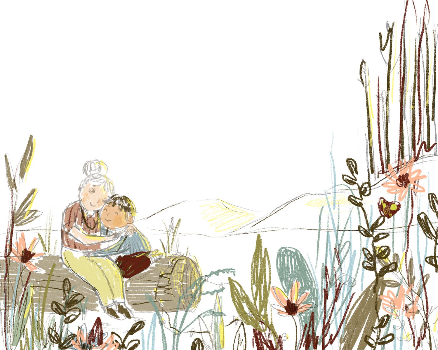
For this illustration, unusually, the colours didn’t change too much from my initial palette. I knew I wanted a soft, warm scene, with a kind of late summer, early evening glow and the colours came together from there. In many of my pieces, however, it doesn't happen so seamlessly and I often go through endless colour test layers in Procreate before I’m finally happy to start rendering.
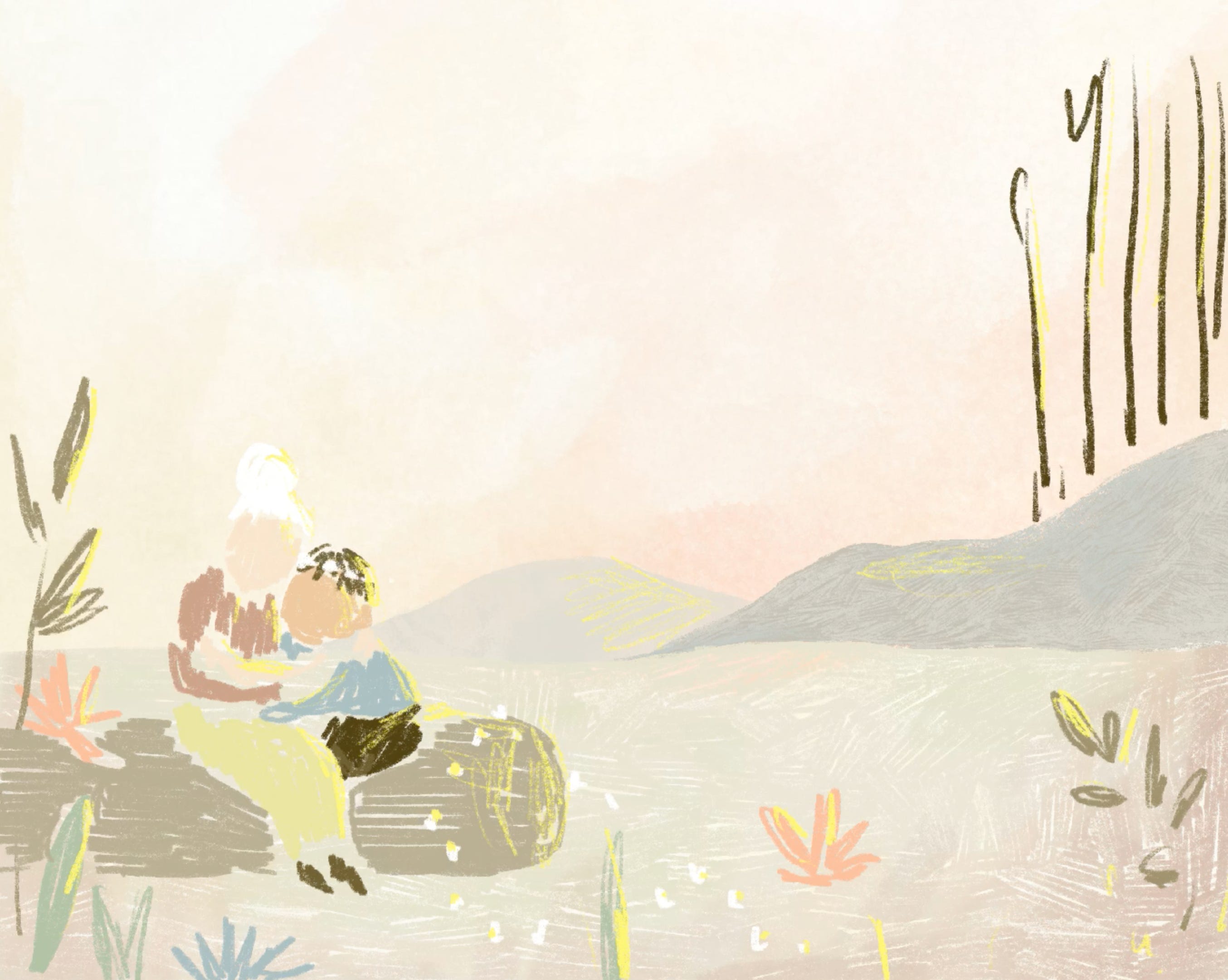
For the sky, I built up the texture and colour in layers, as you can see here. I used a large watercolour brush in Procreate and applied each colour on a separate layer. You can see that the balance isn’t quite right by the end of this video but it gave me a strong enough starting point to continue with the illustration, knowing I could alter transparency levels and remove layers later on in Photoshop. I always prefer to have more layers than I need to give me options.
Texture
I love to pack different textures into my work- the scratchier the better! I think it adds to the movement of the pieces and stops them feeling too flat. In most of my illustrations, I use a maximum of two or three different Procreate brushes to make the textures.
You can see in the close-ups above, that the sky and background hills have different texture effects (both created by large texture brushes) but the rest is made up of the same, finer texture. This is the finish I use most often in my work and the only way I’ve found to achieve it is to manually draw each individual stroke by hand. I use the standard Procreate pencil tool (or a version of it that I’ve edited) in various thicknesses and then change the colouring technique/stroke direction to add variation, just as you might when using traditional pencil crayons.
I like to try and add the texture in one take- so if I make “mistakes” or go over the edges, I’ll keep them in for the most part. Again, I feel like this stops the piece from feeling too static. It’s so tempting with digital art to edit all of the imperfections out and to go overboard with the eraser tool! But I really love that organic feel you get in traditional mediums and I guess this is a little nod to that.
I generally keep each area to two or three layers (plus a background fill in a slightly lighter shade, which stops each section being too transparent). I’ll start with my main colour, then add a touch of shade and a bit of a highlight, making sure I keep my hand light and steer clear from going too realistic. A light touch is key for me here- I want it to feel simple and fresh, not overworked, which is sometimes a very fine line!
When I’ve applied the textures and added the details in Procreate, it’s over to Photoshop to do the final edits. I’ve done a separate post about this stage, which I’ll be posting shortly.
If you got this far then thank you! I’d love to hear your thoughts on this kind of content. Would you like to see more or less of it? Let me know!
Please consider sharing my post if you enjoyed it!
Thanks for reading,
Kate x
LOVE! Thank you for sharing this my love, I struggle with colour and you always smash it so this is so helpful. Xx
Thank you Kate for sharing your process. Your illustrations look so delightful. It’s easy to forget how much work is hidden behind. Looking at your process videos makes me want to do more digital work 😃 and reading your post I feel like you will have a traditional media holiday soon ❤️ I would love to know which size do you plan your illustrations and how much dpi, also how many layers do you use in average?